5. Identifying High Performance and Key Intangible Performance Indicators (KIPIs)
What is a KIPI? The short answer
A KIPI is the mojo that sets a high performing organization apart from others. Intangible aspects like good decision-making, artistic and managerial expertise, reputation and relationships, intellectual capital, and the quality of the work force all influence an organization’s performance. We call them KIPIs, or Key Intangible Performance Indicators. Because these traits are, by nature, intangible, we cannot easily observe and measure them. And yet we all know how important they are. By using a statistical technique that we call “high performance frontier analysis,” we can estimate how much these intangibles play a role in setting an organization apart from others. This is a method that has helped many other industries understand high performance and the best practices that drive it.
We start by creating a level playing field, much like you see in golf, where the tees are staggered to give men, women, and seniors a more equal chance at achieving the same score. For arts and cultural organizations, we adjust the playing field for numerous organizational characteristics, like budget size and age, since we know that older and larger organizations tend to have higher performance on many performance measures. The organization’s community plays a role, too, so we adjust the starting point for those characteristics, too.
Even when the playing field is as level as we can get it, organizations still perform differently than one another. That’s where the intangibles come in. Going back to the golf analogy, it’s accounting for the fact that one golfer is simply a better golfer than another so, all else being equal, she scores better. With KIPIs, we can estimate just how much of performance was due to expertise by measuring how far a score is from what we’d expect it to be given the organization’s operating characteristics and conditions. Moving forward, we will begin to explore and understand what the secret is to success for high-performing organizations for those who want to achieve similar results. Not everyone will want high performance on every measure. Each organization will have its own sense of priorities.
The last element that we have to account for is that some differences in performance are random. One of our golfers may have teed off earlier than the other golfer and played in morning fog. An inexperienced golfer can hit a rock near the green and end up getting a lucky bounce into the hole. Even understanding the impact of expertise isn’t enough to fully understand what may be going right or wrong. Some performance outcomes are relatively easy and others are very difficult to explain.
WATCH: An Overview of High Performance and KIPIs
What is a KIPI? The more thorough answer
Stochastic frontier analysis, what we refer to as “high performance frontier analysis,” is an analytic method that is in search of the ‘above average’. It explores the frontier of maximum feasible output given a set of inputs. When we talk about ‘performance’ of arts and cultural organizations, there may not be one right answer or a single ideal out there towards which everyone should strive. What we do know, however, is that: 1) Arts organizations do perform differently on different outcome measures, and 2) Any conversation about outcomes or performance immediately raises the question, “Relative to what?” Traditionally, there are two ways of establishing a comparison standard.
One approach is to use quantitative methods to break down data to determine what the ‘average’ performance is for a group of organizations. These analyses may create average or aggregate scores and show changes over time. For example, the National Arts Index, a project and publication of Americans for the Arts, established a series of health indices using 2003 as the benchmark year, meaning that all performance is scored relative to that year. WESTAF created the Creative Vitality Index (CVI), which reflects the relative economic health of a selected geography's creative economy. These analyses use a different methodology and address outcomes more germane to cultural policy purposes than ours, but it is useful to see what story different approaches and different reference points reveal.
Another approach is to identify best practices or outcomes and try to evaluate how well an organization implements or achieves these ideal outcomes. These analyses frequently involve subjective assessments that may demonstrate questionable reliability. Scoring in many Olympic events and university rankings offer examples of this approach to establishing comparison standards.
High performance frontier analysis uses statistical methods to identify best outcomes and evaluate how close each organization comes to that best outcome. Scores range from 0 to 100, with scores approaching 100 representing ‘high performance’ outcomes. There is no predetermined ‘average’ score; rather, the average can be calculated after or as part of the analysis. The scores may approximate a normal bell curve, with half of the organizations performing below an arithmetic mean of 50, but it may turn out that there is an exaggerated tail in the distribution, with a small number of truly exceptional performers skewing the distribution.
So how does high performance frontier analysis accomplish this? The analyses required to incorporate all of these various inputs is complex but the basic idea is similar to regression analysis, which shows how a series of independent factors affect an outcome. This is useful for understanding how two variables are related; for example, human height and weight are usually correlated so that, on average, taller people weigh more than shorter people. But as we know, there are sometimes large deviations from this ‘average’ relationship. And these deviations have two distinct components. One component is individual behavior, including exercise and calorie intake. Though somewhat more difficult to track and measure than height, these activities are observable and measureable. Research suggests other, less tangible characteristics also play a role, including genetic make-up or thyroid activity. Finally, there probably are factors that determine weight that are as yet completely unknown.
So the determinants of a person’s weight can be classified into three broad categories: (1) relatively easy-to-observe-and-measure characteristics like height, exercise, and calorie intake; (2) difficult-to-observe-and-measure characteristics like genetic make-up and thyroid activity; and (3) impossible-to-quantify variations that we may understand in the future but for now must be viewed as random variations. Using stochastic frontier analysis, we adopt the same perspective for understanding the determinants of performance on a variety of measures in arts and cultural organizations. Specifically,
- There are a large number of relatively easy-to-observe-and-measure characteristics from the arts and culture ecosystem that can affect an organization’s performance;
- There are also some intangible, difficult-to-observe-and-measure characteristics like good decision-making, managerial and artistic expertise, and the quality of the work force that affect an organization’s performance; and
- There is some level of random variation that we can estimate but cannot explicitly model.
We describe the effects of four types of relatively easy-to-observe-and-measure characteristics that influence an organization’s performance in the Driving Forces section. We used these measures to build a model for each of the outcome measures – i.e., one for the numerator and one for the denominator --required to construct the Arts and Culture Performance Indices, each of which is a ratio. This model simultaneously estimates:
- The relationships between predictor and performance outcome variables, which are described in the Driving Forces section;
- The component of unexplained variation attributable to intangible influences on performance like good decision-making, managerial or artistic expertise, strong reputation, etc.; and
- The random variation.
Think about the figure shown below, which maps different Marketing Expense/Attendance combinations (which represent the Response to Marketing Efforts Index, one of the Marketing Impact Indices). These combinations show a logical trend, with larger marketing expenditures generally producing greater attendance. The red dotted line captures that trend. Despite the trend, however, there is significant variation, with individual observations appearing above and below the line.
Plotting the Relationship between Attendance and Marketing Expenses
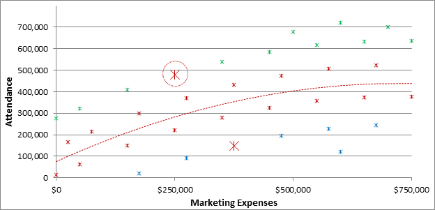
Notes: Blue asterisks represent low performers; red represent average performers; and green represent high performers. Marketing Expenses include both staff and non-staff marketing costs.
The asterisks appearing above the red line represent higher attendance per marketing dollar spent. The asterisks appearing below the line represent lower attendance per marketing dollar spent. The color coding indicates Marketing Expense/Attendance combinations that are low (blue), about average (red), and high (green). Two exceptions or “outliers” that are circled in red will be explained below.
What explains the variations in these Marketing Expense/Attendance combinations? As described above, there are three general categories: (1) easy-to-observe-and-measure organizational, community and cultural policy factors that are detailed in the Driving Forces section; (2) the intangible, difficult-to-observe-and-measure characteristics like good decision-making, artistic and managerial expertise, reputation and relationships, and the quality of the work force that affect an organization’s performance; and (3) some level of random variation.
Controlling for organizational, community and cultural policy factors (#1 above) is critical because it creates a level playing field for all organizations. Before we can determine if an organization is truly performing poorly or well, we have to take into account the organization’s sector, its size, its location, its community characteristics, the local cultural policy conditions, and everything else we can think of that might affect its situation. Once we have done so, only then can we ask, “All else being equal, is this organization’s performance better or worse than that of other organizations on a given outcome?”
For example, we expect that an older organization with lots of resources (measured as budget size) that is located in a community with low total arts dollar activity should perform better on the Response to Marketing Efforts Index. This means that, for this large organization in a munificent community, being above the red line in the figure above is expected. So unless the organization’s Marketing Expense/Attendance combination is quite far above the line, we would view its performance as just average. This type of exception appears in the figure above as a large red asterisk circled in red above the red line.
On the other hand, a nascent organization with a small overall budget, located in a community with high total arts dollar activity, faces greater challenges to draw attendees. Given these challenges, a Marketing Expense/Attendance combination that is below average might be viewed as average performance rather than low. The large red asterisk circled in red that appears below the red line in the figure above represents this type of exception.
After creating a level playing field, we can then estimate how much of the remaining variation is attributable to intangible, difficult-to-observe-and-measure characteristics like good decision-making and artistic expertise and how much is simply random variation. We all recognize that the success of organizations in the arts, perhaps more than any other industry, is driven by managerial and artistic expertise. This expertise is very difficult to observe and measure but not impossible to estimate. This estimate, which we call a Key Intangible Performance Indicator (KIPI), represents the single most valuable output from our data collection, spatial model-building, and analysis efforts.
It may well be that scoring high on a KIPI would indicate that the organization is achieving its objectives, or an organization may WANT to be below the frontier. Not every organization will prioritize every performance measure, which is why we provide a menu of measures to consider. The KIPIs are not prescriptive; they are just information about performance relative to others in the field, taking organizational, community, and policy characteristics into account. For example, one earned revenue index compares the amount of program revenue earned per person in attendance. An organization that is heavily reliant on ticket revenue, charges tuition for classes that it offers, and generates parking, advertising and concession revenue may strive for a high score on this KIPI. By contrast, another organization that has a mission-related mandate to keep admission prices low, offers educational programming that is free of charge to participants, and generates only a small amount of advertising and concession revenue may judge its own success by how low it is able to keep its score on this measure.
Individual KIPIs that Control for Organizational, Community and Sector Characteristics
Although a high-level analysis offers some intriguing insights, more useful insight can be gleaned from examining individual KIPIs at the organizational level. In this section, we again map Response to Marketing Efforts (i.e., Marketing Dollar spent per Attendee) to illustrate a KIPI’s value. We now use actual examples of anonymous organizations to demonstrate how KIPIs take into account the characteristics of the organization, arts and cultural sector, community, and cultural policy. In each figure, we map organizations that earned relatively low KIPIs (i.e., below 30), mid-range KIPIs around 50, and relatively high KIPIs above 60. To simplify comparisons, we limit the examination to organizations that spent between $100K and $1M on marketing in 2012.
WATCH: How KIPIs Account for Organizational Characteristics
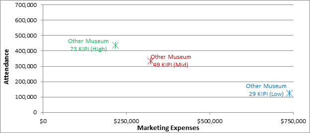
We look at six sectors, starting with a focus on Other (including Children’s, History, Natural History, and Science) Museums. We show three Other Museums in the first figure below, which plots an organization’s Marketing Expenses and its Attendance and gives the organization’s KIPI score. Note that you won’t be able replicate the KIPI calculation from the numbers provided in the chart (it is a complex equation!). The low-KIPI (KIPI=29) museum spends nearly $750,000 on marketing (total budget nearly $12M). The mid-KIPI (KIPI=49) museum spends more than $300,000 on marketing (with a total budget around $4M). The high-KIPI (KIPI=73) museum spends a little more than $200,000 on marketing (total budget around $20M). These three organizations demonstrate the basic idea behind the Response to Marketing Efforts Index; that is, the KIPI goes up as the Marketing Expense/Attendance ratio increases.
A Simple Pattern of Individual KIPIs for Three Other Museums
This simple idea is complicated by the fact that the playing field is not level for all organizations. Some organizations have larger physical spaces and budgets, some are located in more or less supportive communities, and some receive greater government or foundation support. In the next section, we expand our sample to six Other Museums to demonstrate how controlling for (1) organizational characteristics such as budget size and pricing decisions and (2) community factors creates a level playing field for KIPI estimation.
KIPIs Account for Organizational Characteristics like Budget Size and Pricing Decisions
In the figure below, we add in three more Other Museums and color-code them to indicate whether their KIPI is in the low (blue), mid (red), or high (green) range. We first note how organizational size has no obvious effect on KIPIs. For example, looking at the two low-KIPI organizations, the 23-KIPI museum spends under $100,000 (total budget just over $1M), and the 29-KIPI museum spends nearly $750,000 on marketing (total budget nearly $12M). The 73-KIPI museum spends a little more than $200,000 on marketing (with a total budget around $2M); the 70-KIPI museum spends over $700,000 on marketing (total budget around $1M).
We included budget size as one of the Driving Forces and it exerted a positive effect on both Attendance and Marketing Expenses. This means that, all else equal, a small budget-size organization that spends an equal amount on marketing and attracts an equal number of attendees as a large-budget organization receives a higher KIPI than the large budget-size organization. Budget size is one reason why the 49-KIPI museum has nearly the same score as the 52-KIPI museum even though it spends more on marketing and has far fewer attendees. The 52-KIPI museum’s budget is nearly three times the size as the 49-KIPI museum.
WATCH: How KIPIs Account for Budget Size and Pricing Decisions
Patterns of Individual KIPIs for Six Other Museums
But there are other organizational factors that explain why the 49-KIPI museum receives nearly as good a score as the 52-KIPI museum that spends less on marketing and attracts 70% more people. The 49-KIPI organization offers far fewer permanent (2 versus 20) and temporary (5 versus 10) exhibitions than the 52-KIPI museum; all else equal, a larger number of exhibitions has the potential to attract more people. The 49-KIPI organization also charges a higher price ($9.50 versus $7) than the 52-KIPI museum; all else equal, a museum charging higher ticket prices has to spend more to attract customers than a museum charging lower ticket prices. Remember, the Response to Marketing Efforts KIPI does not try to evaluate whether fewer or more exhibitions or higher or lower prices are good or bad decisions; rather, it assesses marketing effectiveness given other organizational decisions such as programming and price.
KIPIs Account for Community Characteristics
It also seems surprising at first glance that the 70-KIPI museum spends much more on marketing than the 73-KIPI museum, attracts a similar number of attendees, and receives nearly the same score. These similar KIPI scores for different Marketing Expense/Attendance ratios are attributable to both organizational and community characteristics. As with the mid-KIPI example above, the 70-KIPI museum has fewer exhibitions and charges higher prices than the 73-KIPI museum; these programming and pricing decisions place greater demands on marketing at the 70-KIPI museum to bring people in. Adding to this challenge, the 70-KIPI museum is located in a community with much weaker support for other museums as measured by the combined total program and contributed revenue generated by this sector. This figure is more than 13 times higher in the 73-KIPI museum’s market than in the 70-KIPI museum’s market. All else equal, a museum charging higher ticket prices in a community that provides less support for the arts has to allocate more marketing resources to attract the same number of visitors as a museum charging lower ticket prices in a community that provides less support for the arts. By including these community characteristics in the Driving Forces analysis, we have created a level playing field for these organizations that face very different marketing challenges.
KIPIs also Account for Sector Characteristics
In the following figure, we compare the first three Other Museums highlighted above with three Art Museums and three Arts Education organizations. We continue to use the same color coding; that is, low KIPIs in blue, mid-range KIPIs in red and high KIPIs in green. The symbols in the figure indicate the sector for each organization.
WATCH: Using KIPIs to Account for Sector Characteristics
Comparing Other Museums, Arts Museums, and Arts Education
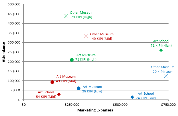
We already examined these three, simply-aligned Other Museums. In the Art Museum sector (the circles), the low-KIPI organization has relatively high marketing spend and low attendance; the mid-KIPI organization has lower marketing spend and slightly higher attendance; and the high-KIPI organization has medium marketing spend and medium-high attendance. In the Art School sector (the diamonds), the low-KIPI organization has high marketing spend and relatively low attendance; the mid-KIPI organization has lower marketing spend and slightly higher attendance; and the high-KIPI organization has high marketing spend and high attendance.
The key takeaway from this figure is how KIPIs are scaled differently for each sector. Managerial and artistic expertise and good decision-making manifests itself differently for different sectors given the inherently different sector characteristics, but it exists in all sectors nevertheless. Comparing the mid-KIPI Art School to the mid-KIPI Art Museum, we see that the Art School has a slightly higher KIPI than the Art Museum – 54 versus 49, respectively -- even though the Art School spends more to attract fewer people. Comparing the high-KIPI Art Museum and the high-KIPI Other Museum, which have nearly identical KIPIs (71 and 73, respectively), we see that the Art Museum spends slightly more on marketing to attract far fewer people (approximately half). These patterns are consistent with the sector Averages for Response to Marketing Efforts, which indicate that Other Museums ($2.17) have to spend much less per attendee than do Art Museums ($2.87) or Arts Education ($3.12). This doesn’t mean that there is more expertise in high-KIPI Other Museums than high-KIPI Art Museums; it means that expertise produces different results for different sectors.
The previous figure demonstrates how Other Museums have to attract greater attendance per marketing dollar to earn the same KIPI on the Response to Marketing Efforts Index as an Art Museum or Art Education organization. These differences are even greater for Dance companies (that spend $7.81 per attendee), Symphonies (that spend $8.68 per attendee), and Theaters (that spend $7.43 per attendee). These differences in scale lead us to use a separate figure to map these sectors.
First, note that the Attendance axis peaks at 100,000 for these sectors compared to 500,000 in the previous figure. Again, these differences are factored into evaluating KIPIs for organizations in different sectors. For example, the mid-KIPI Symphony in the figure below (the red X) spent nearly $700,000 to attract around 90,000 customers and received an identical KIPI (49) as the mid-KIPI Art Museum (the red in the figure above) that spent less than $200,000 to attract approximately the same number of customers. It’s just the nature of the different operating models in these different sectors.
Comparing Dance, Symphony and Theater Sectors
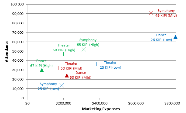
We see similarities and differences when we compare the patterns in this figure with the patterns for Arts Schools, Art Museums and Other Museums. Worth noting, in the Dance sector (the triangles) the low-KIPI organization spent a lot of money to attract a relatively large audience while the high-KIPI organization spent relatively little money to attract a much smaller audience. The pattern is much different in the Symphony sector, where the low-KIPI organization spent nearly $200,000 to attract around 14,000 people while the mid-KIPI organization spent nearly $700,000 to attract 90,000 people. The Theater sector (the ‘+’ signs) features three organizations that are more similar in terms of Attendance and Marketing Expenses than organizations in the other sectors. The low-KIPI organization has relatively higher marketing spend and moderate attendance; the mid-KIPI organization has lower marketing spend and slightly lower attendance; and the high-KIPI organization achieves higher attendance with a marketing spend between the other two.
KIPIs Also Help Identify the Source of the High Performance
We would also like to point out another insightful feature of the KIPIs. Because one way to assess Marketing Impact is to examine Marketing Expenses (including personnel)/Attendance, the Response to Marketing Efforts Index KIPI is composed of two distinct KIPIs, one for Marketing Expenses and one for Attendance. This allows us to decompose a KIPI and identify whether a low (or high) score is attributable to attracting too few people or spending too much relative to other organizations. Attracting too few people could be caused by programming choices (relatively few people want to see what you are offering) or ineffective marketing (the target audience is not aware of the offering or the message fails to stimulate action). Spending too much money suggests that the marketing effort is either ineffectively allocated or focused on objectives other than increasing attendance.
We began the analysis by looking at KIPIs in 2012 for all dance companies, symphonies, operas and theaters. We defined low-KIPI organizations as all those scoring under 30, mid-KIPI organizations as 30-59, and high-KIPI organizations as 60 and above. We scaled the Attendance and Marketing Expense KIPIs so that 0 equals the average score, 1 equals one standard deviation above average, and -1 equals one standard deviation below average (a standard deviation is a measure of how spread out the numbers are from the average). This measure simply indicates to what extent an organization or group of organizations is above or below average.
The scores suggest interesting differences between the low-, mid-, and high-KIPI organizations. The high-KIPI organizations score 5 standard deviations above average on the Attendance KIPI and .3 standard deviations below average on the Marketing Expense KIPI. In other words, high-KIPI organizations tend to overspend a little on marketing but they far outperform the average in terms of attendance. The average Marketing Expense KIPI for mid-KIPI organizations is the same as the high-KIPI organizations (i.e., -.3) but they score much lower on the Attendance KIPI, although still 1.13 standard deviations above the average. We can infer that these organizations are spending enough on marketing but that they either need to increase the appeal of their program offerings or increase the effectiveness of their marketing to increase their Response to Marketing Efforts KIPIs. Low-KIPI organizations have a radically different profile. They score .30 standard deviations above average on the Marketing Expense KIPI but -2.2 standard deviations below average on the Attendance KIPI. We are left to wonder whether poor performance on the Attendance KIPI is driven by less popular program choices, ineffective marketing activity, insufficient allocation of resources to marketing, or a conscious decision not to try to bring in more people. A key takeaway from this analysis is that scoring high on a single dimension (in this case, Marketing Expenses) does not necessarily translate into high overall performance.
Finally, we more closely examine the mid-KIPI Dance company to see how the KIPI can be used to inform managerial decisions. Remember, the analyses that estimate the KIPIs control for all of the easy-to-observe-and-measure characteristics that can affect an organization’s performance; specifically, the organizational, community, and cultural policy factors described in the Driving Forces section. Understanding and controlling for these influences, we can conclude that the mid-KIPI dance company actually performs much better than average on the Attendance dimension: 3.7 standard deviations above the average. Unfortunately, it also performs much worse than average on the Marketing Expense dimension: 3.7 standard deviations below the average. These results indicate that they’re spending far too much on marketing. They may want to critically examine how they spend their marketing dollars and incrementally reduce spending in areas that reap little return without lowering attendance.
Would You Like to Know Your KIPIs?
As a service to arts and cultural leaders, NCAR has created a free, diagnostic tool, the KIPI Dashboard, which provides your organization's financial and operating performance results relative to organizations like yours nationally so you can assess health and sustainability and hone strategic decisions. Learn more here
WATCH: Want to Know Your KIPI Score?